📖 CSS Colors and Backgrounds
Using Color on the Web
Color plays an important role in web design, influencing both visual appeal and accessibility. CSS allows you to apply color to text, borders, and backgrounds using named values, hex codes, RGB, HSL, and gradient techniques.
Named Colors
Modern browsers support over 140 named colors, not just the original 17 defined in early HTML standards. These include names like lightcoral, rebeccapurple, and goldenrod. You can view the full list at W3Schools: Named Colors.
h1 {
  color: red;
}
div {
  background-color: green;
}
Hexadecimal Color Codes
Hex codes represent RGB color values in hexadecimal format (base-16). Each pair of digits represents red, green, or blue values. Example: #000000 (black), #FFFFFF (white). Abbreviated versions like #FFF are also allowed. Learn more at W3Schools: Hex Colors.
p {
  color: #C94;
}
RGB and RGBA
RGB uses numeric or percentage values for red, green, and blue. RGBA includes an alpha value for transparency. You can learn more at W3Schools: RGB Colors.
p {
  color: rgb(204, 102, 0);
  color: rgba(204, 102, 0, 0.5);
}
HSL Colors
Hue, Saturation, and Lightness (HSL) offer another way to specify color using more intuitive values. Learn more at W3Schools: HSL Colors.
div {
  background-color: hsl(180, 50%, 50%);
  color: hsl(0, 0%, 100%);
}
Choosing a Color Format
All color formats work in modern CSS, but each has its advantages:
- Named Colors: Quick to type, but limited in variety.
- Hex Codes: Common and compact, good for design handoffs.
- RGB / RGBA: Useful when adjusting transparency or mixing colors.
- HSL: Easier to tweak brightness and hue programmatically.
Color Accessibility and Selection
Color should enhance usability and readability. Good color choices support contrast, clarity, and mood. Explore these tools to build accessible palettes.
The WCAG guidelines recommend a minimum contrast ratio of 4.5:1 between text and background for standard text to ensure readability for users with low vision.
Examples of Contrast
Here are some examples showing good and poor color contrast:
The left example uses black on white, which has excellent contrast. The right example uses light gray on white, which is harder to read and may not meet accessibility guidelines.
Consider Color Blindness
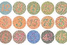
When designing your site, it's important to choose colors that work well for everyone, including users with color vision deficiencies (commonly called color blindness). Around 1 in 12 men and 1 in 200 women are affected by some form of color blindness, so thoughtful color selection helps ensure your site is usable by a wide audience.
Colors that may look distinct to you can appear very similar or blend together for someone with color blindness. To demonstrate this, review the following image and see how well you can identify the numbers on each background:
Keep color contrast strong and avoid relying solely on color to convey meaning. Pair colors thoughtfully and test your designs using accessibility tools or simulators. This practice not only improves inclusivity but often results in cleaner, more professional designs.
The Web Content Accessibility Guidelines (WCAG), which are the standard for web accessibility, specifically mention color contrast and use of color.
-
WCAG 1.4.1 (Use of Color): Do not rely on color alone to convey information.
-
WCAG 1.4.3 (Contrast Minimum): Ensure sufficient contrast between text and background.
These are designed to help users who have color vision deficiencies as well as other low vision conditions.
Try It: Color Picker
Use the browser’s built-in color selector to explore color values interactively:
You can also compare foreground and background colors using a contrast checker tool:
This tool helps you explore hex values using the native browser color picker.
Explore Color Theory and Tools
Background Styling
Background styles include colors, images, and gradients.
background-color- Sets background color.
background-image- Sets background image.
background-repeat- Controls image tiling:
repeat,no-repeat,repeat-x,repeat-y. background-position- Controls image placement (e.g.,
left top). opacity- Controls transparency (0 = invisible, 1 = fully opaque).
div {
  background: green url("bg.jpg") no-repeat center center;
  opacity: 0.8;
}
Multiple Backgrounds
CSS supports multiple background images layered in order from front to back.
div {
  background:
    url(image1.jpg) repeat-x top left,
    url(image2.jpg) repeat-x bottom left,
    url(image3.jpg) no-repeat center center;
  background-color: black;
}
CSS Gradients
CSS gradients let you create smooth color transitions. Use tools like the ones below to generate gradient styles:
/* Linear Gradient */
background: linear-gradient(to right, #2F2727, #1a82f7);

/* Radial Gradient */
background: radial-gradient(circle, #1a82f7, #2F2727);
Key Terms
- Hex Code
- Color value using base-16 notation (e.g.,
#FF0000). - RGB
- Color defined using red, green, blue values (0–255).
- RGBA
- RGB color with added transparency value (0–1).
- HSL
- Color defined by hue, saturation, and lightness.
- Gradient
- A smooth color transition used for backgrounds and visual effects.
Additional Resources
Last updated: July 3, 2025 at 8:40 PM