📖 CSS Animations
Animation allows you to create simple animations without JavaScript. @keyframes rule is where the animation is created. Specify a CSS style inside the @keyframes rule. The animation will change from the current style to the new style behaving as specified in the animation rule. You can specify when the change will happen in percent, or the keywords "from" and "to", which is the same as 0% and 100%. 0% is the beginning of the animation, 100% is when the animation is complete.
Some people have difficulty making these work as expected. There are some great examples at W3 schools and at css-tricks.
Basically, you can animate any css property. Here's one that fades an image.
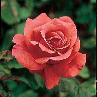
Animate Fade In and Out
This image fades in and out elements every 10 seconds (continuously) using animation.
div {
	width: 160px;
	height: 160px;
	background-image: url('//storage/uploads/rose1.jpg');
	animation-name: example;
	animation-duration: 10s;
	animation-iteration-count: infinite;
}
@keyframes example {
	  0% { opacity: 1; }
	 50% { opacity: 0; }
	100% { opacity: 1; }
}
Examples
Make a div element move gradually 200px down.
@keyframes mymove {
	from { top: 0px; }
	to { top: 200px; }
}
Add multiple keyframe selectors in one animation.
@keyframes mymove {
	  0% { top: 0px; }
	 25% { top: 200px; }
	 50% { top: 100px; }
	 75% { top: 200px; }
	100% { top: 0px; }
}
Animation created in @keyframes must be bound to a selector to take effect.
animation: name duration timing-function delay iteration-count direction;- name
- is the name created in the @keyframes rule - required
- duration
- is length of the animation in s (seconds) - required
- timing-function
- specifies the speed curve of the animation. Default is ease.
- linear - The animation has the same speed from start to end
- ease - Default. The animation has a slow start, then fast, before it ends slowly
- ease-in - The animation has a slow start
- ease-out - The animation has a slow end
- ease-in-out - The animation has both a slow start and a slow end
- cubic-bezier(n,n,n,n) - Define your own values in the cubic-bezier function. Possible values are numeric values from 0 to 1
- delay
- specifies a delay before the animation will start in s (seconds). Default is 0.
- iteration-count
- specifies how many times an animation should be played. Default is 1. May be a number or infinite.
- direction
- defines whether or not the animation should play in reverse on alternate cycles. Default is normal. To reverse, use alternate
Example
div {
	animation: mymove 5s linear 2s infinite alternate;
}
The next example is from W3 schools. They make a colored square move around in square pattern while changing colors.
div {
  width: 100px;
  height: 100px;
  background-color: red;
  position: relative;
  animation-name: example;
  animation-duration: 4s;
  animation-iteration-count: infinite;
}

@keyframes example {
  0%   {background-color:red; left:0px; top:0px;}
  25%  {background-color:yellow; left:200px; top:0px;}
  50%  {background-color:blue; left:200px; top:200px;}
  75%  {background-color:green; left:0px; top:200px;}
  100% {background-color:red; left:0px; top:0px;}
}