📖 CSS Grid
CSS Grid is a new layout mode in CSS3 that allows the designer to create a two-dimensional layout grid for a web page kind of like a table and position items on the page in the grid. Grid consists of a grid container and child elements which are displayed in that container. To create a grid container, add display: grid; to the css.
There are many tutorials online. Two of my favorites are W3 Schools on Grid Layout and CSS-Tricks Complete Guide to Grid. The first is more of a beginner guide and the second has more depth and detail. Both are great for study to understand CSS Grid.
The grid is composed of rows and columns. Items are positioned in the container along the grid lines of the container and may occupy as many of the grid sections as needed. Items may be specifically placed in the grid or may flow naturally into the grid containers based on their position in the web page.
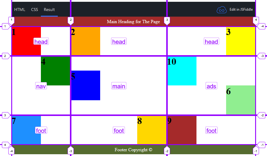
The grid below appears to be about 6 columns wide by maybe 4 or 5 rows deep, but it's not. It's actually a 3X3 grid with 100px boxes positioned in the grid areas using a variety of positional properties. Study the CSS to see if you can figure out how each box was created and positioned.
You can use Ctrl + Shift + i to view the page properties and turn on the grid overlay. If you did, you would see something like the image below. It is a screenshot of the grid overlay of the above page display. You can see the grid lines and area names shown on the grid and defined in the CSS. This is a rather random example of how you use CSS Grid to create a grid-like structure and position elements within the grid. However, you will be using CSS Grid to create a page layout. When you do, you may realize how much help it is to position elements using the named areas. The heading and footer in the example aren't located within the grid, but you might want to use the grid to position the header and footer on the page. You would simply assign a class to the desired area then assign the class to the header or footer tag without specifying element size. The default is to fill the space provided.

The CSS Grid layout is very flexible and gives the designer a lot of control over the design. CSS Grid is supported by all the latest browser versions except for Internet Explorer and Opera Mini.
Parent (Grid) Properties
Display
display: grid;
/* Rendered as a block container */
display: inline-grid;
/* Rendered as inline container */
grid-template | grid-template-columns | grid-template-rows
Defines the rows and columns of the grid. The size of each column or row may be specified using px, %, em, fr or auto. 1fr is one fractional unit. A column that is 2fr will be twice as wide as one that is 1fr. A column or row specified as auto will take up any remaining room in the allocated space. To create multiple rows or columns that are the same size, use repeat (qty, size).
grid-template-rows: 50px auto 100px;
/* Creates 3 rows. */
/* The top row would be 50px tall. */
/* The bottom row would 100px tall. */
/* The middle row would take up whatever space is needed. */
grid-template-columns: 1fr 2fr 1fr;
/* Creates 3 columns. The middle column would be twice as wide as the first and last columns. */
grid-template: repeat(3, auto) / 20% 60% 20%;
/* Creates a grid with 3 rows with auto height (space needed) */
/* 3 columns with the left and right columns taking up 20% of the space and the middle column 60%. */
grid-template-areas
Allows you to assign names to areas of the grid which can then be used for item placement.
grid-template-rows: 200px auto 200px;
grid-template-columns: 300px auto;
grid-template-areas:
	"head head"
	"menu main"
	"foot foot";
/* This creates a three row by two column layout. */
/* The top row is assigned the name head as an area. */
/* The first column of the middle row is assigned the name menu as an area. */
/* The second column of the middle row is assigned the name main as an area. */
/* The bottom row is assigned the name foot as an area. */
/* This creates a standard two column layout with the head and foot spanning the width of the page. */
grid-gap
Specifies the amount of whitespace between the grid cells (gutters). Default is 0.
grid-row-gap: 5px;
/* Leaves 5 pixels of whitespace between rows. */
grid-column-gap: 1%;
/* Leaves 1% of available width between columns. */
grid-gap: 5px 1%;
/* Leaves 5 pixels of whitespace between rows and 1% of available width between columns. */
grid-gap: 5px;
/* Leaves 5 pixels of whitespace between rows and columns. */
justify-items
Aligns content within a grid cell along the row axis.
justify-items: start;
/* Content is left-aligned. */
justify-items: end;
/* Content is right-aligned. */
justify-items: center;
/* Content is centered horizontally. */
align-items
Aligns content within a grid cell along the column axis.
align-items: start;
/* Content is top-aligned. */
align-items: end;
/* Content is bottom-aligned. */
align-items: middle;
/* Content is centered vertically. */
justify-content
Justifies all grid content on row axis when total grid size is smaller than container.
justify-content: stretch;
/* (default) Items are stretched to fit the container. */
justify-content: start;
/* Items are positioned at the left of the container. */
justify-content: end;
/* Items are positioned at the right of the container. */
justify-content: center;
/* Items are positioned at the center of the container (horizontally). */
justify-content: space-between;
/* Cells are evenly distributed horizontally in the grid container with spacing on all sides. */
justify-content: space-around;
/* Cells are evenly distributed horizontally in the grid container, with half-size spaces on either end. */
align-content
Justifies all grid content on column axis when total grid size is smaller than container.
align-content: stretch;
/* (default) Items stretch to take up the remaining space. */
align-content: start;
/* Items are packed toward the top of the grid container. */
align-content: end;
/* Items are packed toward the bottom of the grid container. */
align-content: center;
/* Items are packed toward the center of the grid container. */
align-content: space-between;
/* Items are evenly distributed vertically in the grid container with spacing all around. */
align-content: space-around;
/* Items are evenly distributed vertically in the grid container, with half-size spaces on either end. */
grid-auto-flow
Specifies how items fill the grid if they are not specifically placed.
grid-auto-flow: row;
/* Items flow across the row first then down to the next row. */
grid-auto-flow: column;
/* Items flow down the column first then across to the next column. */
Child (Cell) Properties
grid-column, grid-column-start, grid-column-end
grid-row, grid-row-start, grid-row-end
Specifies the column and row positions for an item. Positions are based on grid lines and may be positive or negative numbers. The keyword span may be used to specify the number of columns or rows to be covered by the item in place of the end value.
grid-column-start: 1;
grid-column-end: 3;
/* Item will fill the first and second columns (between gridlines 1 and 3). */
grid-row-start: 2;
grid-row-end: 5;
/* Item will fill the second - fourth rows (between gridlines 2 and 5). */
grid-column: 1 / 3;
/* Item will fill the first and second columns (between gridlines 1 and 3). */
grid-row: -1;
/* Item will fill the bottom row. */
grid-column-start: span 2 / -1;
/* Item will fill the last and next to last columns. */
justify-self
Aligns the content along the row axis.
justify-self: start;
/* Content is left-aligned. */
justify-self: end;
/* Content is right-aligned. */
justify-self: center;
/* Content is centered horizontally. */
justify-self: stretch;
/* Default - content is stretched to fill the entire cell. */
align-self
Aligns the content along the column axis.
align-self: start;
/* Content is top-aligned. */
align-self: end;
/* Content is bottom-aligned. */
align-self: middle;
/* Content is centered vertically. */
align-self: stretch;
/* Default - content is stretched to fill the entire cell. */
Page Layout with CSS Grid
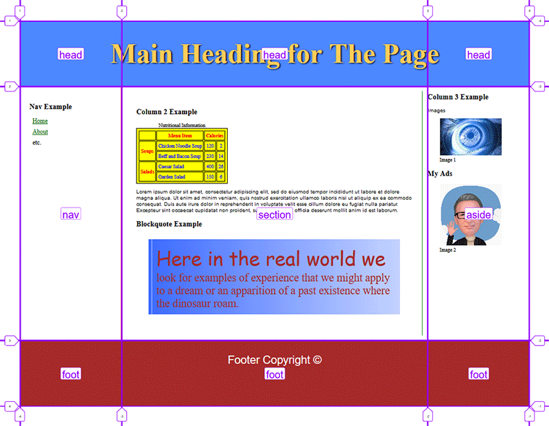
The example below shows a complete page layout using the CSS Grid method. There is a header spanning across the top of the page. There are three columns including a nav section, main content section and and aside. The footer spans across the bottom of the page. The code is shown in the JS Fiddle and the image below that shows where the grid lines are located.

Additional Resources
Grid Garden
https://cssgridgarden.com/
Nesting Flexbox
Flexbox can also be nested within other elements. A common approach to page layout is to use CSS Grid or Flexbox to establish the basic page layout, then use Flexbox within an element to control the display of the element content. For example, a page could use CSS Grid to create the main layout and then use Flexbox nested within one of the elements to control the way the content within the element is displayed. This is often easier than other methods.
Notice in the example below, the main layout is set using the CSS Grid technique, but the footer elements are laid out using Flexbox. The layout is virtually the same as the Flexbox layout shown above, but this is more intuitive for most developers.
